Nov 25, 2010

3 MACINTOSH APPLES watercolor painting demonstration

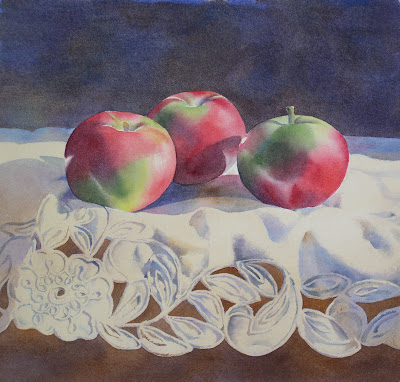
3 MacIntosh Apples
watercolor 11 x 11"


This demonstration uses lots of richly colored layers.

Paints I used:
Dioxazine Violet
Permanent Rose
Napthol Red (Cadmium Red medium is comparable)
Cadmium Orange
Alizarin Crimson
Sap Green
Hookers Green
Prussian Blue
Ultramarine Blue
Cobalt Blue
Burnt Umer
Burnt Sienna
Raw Sienna
Sepia
These paints are either Winsor Newton or M. Graham brand paints

Paper I use is Jack Richeson 300 # cold press watercolor paper


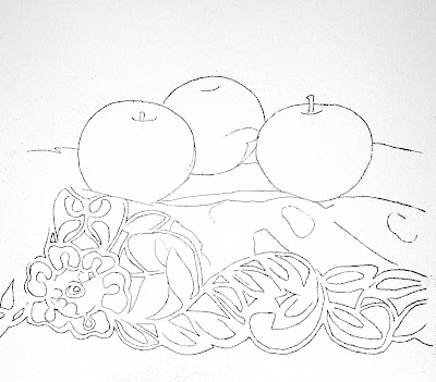
Here is the photograph I worked from. I generally do a simple outline drawing, then blow it up to the size I want to paint.

Here is the drawing.

Step 1. Base Layer
My first layer of wash I call the “Base Layer”. This is generally a wet on wet wash using the actual colors of the subject, in this case, red and green for the apples (Permanent Rose*, Napthol Red, and Sap Green). The apples were first wet with pure water, then the colors were applied by just touching the brush to the paper. The paint is carried by the water, and the 2 colors mix beautifully, with just a few nudges of the brush. Too much brushwork at this point would muddy the colors. Remember, there are lots of layers of color to come, so there is plenty of time to tweak the image. Also, leave white areas for the very light areas and highlights on the apple.


A close up of one apple, Step 1:


The apples were first wet with pure water


Then the colors were applied by just touching the brush to the paper.
Leave white areas for the very light areas and highlights on the apple.


The paint is carried by the water, and the 2 colors mix beautifully, with just a few nudges of the brush.


An extra bit of Permanent Rose on the lower left side, and blotting the hard edge around the stem.


The wash under the lace material is Burnt Sienna, Dioxazine Violet, and Permanent Rose, all flooded into a wet wash. Again, notice how well they mix when added to the wet paper.
The background wash is Burnt Umber, Dioxazine Violet, and Ultramarine Blue.


Step 2. Shadows (photo above)
I use Dioxazine Violet to paint the shadows on the apples, leaving the highlighted areas.
I begin painting the shadows and the detail on the lace using Dioxazine Violet, Cobalt Blue, and Raw Sienna. I don’t mix them, but just dip my brush into a different color from time to time, and let them mix themselves. It can look a little garish at this point, but I know I will be painting over them again , and the shadows will eventually be darkened which will unify the colors.


The lace detail and shadow is coming along. Although painting the lace is tedious, I know that rendering it carefully will make a better painting.

Step 3. Second Layer (photos above and below)
I painted a layer of Ultramarine Blue in the background, and a layer of Burnt Umber below the lace. You can see where I have a few more holes to fill in the lace. I painted another layer of green (Sap Green) and red (this time Alizarin Crimson) on the apples.
For Layer #2 on the apples, I wet the entire apple with water, then flood in the colors**. Remember to leave the highlights.


I painted a very light layer of Raw Sienna over the entire lace area. This helps unify the colors that I used for the shadows, and keeps the material from being too glaringly white, and attention grabbing.


Step 4. Value adjusting (photo above)
The painting needs deeper shadows, and I would like the apples to have richer colors. I paint over the apple’s shadows using Dioxazine Purple in the red areas, and Prussian Blue in the green areas. I paint a little Cobalt Blue on the highlight on the middle apple, and a wee bit of Cadmium Orange on the top right of the first apple.
I deepen some parts if the folds in the lace, and work on the lace detail a little more.


Step 5. Details (photo above)
Another layer of Alizarin Crimson and Sap Green on the apple, this time with a little Hookers Green for the cooler green areas.
I use Dioxazine Violet and Sepia on the stems of the apple.
I deepen the shadows between the apples using Dioxazine Violet and Ultramarine Blue, with a little Alizarin Crimson.
More detail work on the lace, and another layer of Dioxazine Violet under the lace AND in the background.***
The final step is making really dark areas darker (the stems, and shadows right under the apples), and lightening some highlights. I scrub out some lighter areas around the stems, and the highlights and reflected lights with a small, stiff brush and plenty of water.


* when painting a red subject, I usually start with Permanent Rose. It is a rich and warm pink, and looks better then a lighter wash of Alizarin Crimson. I use Alizarin Crimson for dark, intense reds, but a washy version looks dull to me.

** Doesn’t the water wash out the color underneath? No, not as long as you aren’t brushing it too much. The dry paint will stay put for the most part, unless it is disturbed with a lot of brushing. Water, good, Brush, bad.

*** Why so much Dioxazine Violet??? Not quite sure why, but I love it. It is a lovely purple, but also the perfect neutral. It seems to work great as a shadow color on any other color, and seems to cool when a color needs to be cooled, or warm when a color needs to be warmed. Take note, that I almost never mix it with another color, but use it as a wash over another color.

Sep 3, 2010

Watercolor Painting Demonstration by Barbara Fox - " Dreamy Pinks"


Dreamy Pinks
watercolor  9 x 10"

Dreamy Pinks Painting Demonstration

Paints used for this painting: Winsor Newton and M. Graham, Holbein where noted.
Cadmium Lemon
New Gamboge
Sap Green
Hookers Green
Peacock Blue (Holbein)
Cobalt Blue
Prussian Blue
Dioxazine Purple
Permanent Rose
Opera (Holbein)
Quinacridone Red
Quinacridone Violet
Alizarin Crimson

Paper I use is Jack Richeson 300 lb cold press watercolor paper.


Here is the photograph I used for reference.

Oops, can't find it. I'll search, then put it in later.


Step 1 - pencil drawing on the paper.
For a complicated drawing like this, I usually do a tracing of my little photograph, then using my copy machine, I enlarge the image and copy this onto my watercolor paper. I hang the drawing on a big. sunny window, tape the wc paper over the drawing, then trace the image.

Step 2 -the color field
I paint in layers, so step one is painting the first layer. I call this my “base layer”, because I am painting the
color of the subject, albeit with some variety. This is done in sections, painting every other petal, for the rose. Let each section dry completely before painting the section next to it., otherwise the colors will run.


I let the colors blend with a wet-on-wet technique, either:
A. wetting an area with water, then touching the colors on it,

or
B. laying in a colored wash, then adding the second and sometimes third color.
 

I used both techniques in this painting. They give the same results.
Remember, the pigments flow with the water, so let the water do the work!


Slowly but surely, the roses are taking shape. I painted the petals using Hookers Green and Pthalo Blue, with Sap Green on the stem.
Don’t be afraid to use rich and/or dark colors in this first step.


When the rose is completely painted with the first layer, and dry, I paint the background, in this case a spotty color field, again painted wet-on-wet. I used Cadmium Lemon, Hookers Green, Peacock Blue, Prussian Blue, Permanent Rose, Opera, and Dioxazine Violet.


To get this washy effect, wet the entire background area, then drop the colors next to each other . Tilt the paper to let the colors mix, but don’t do too much brushwork.


Step 3 - Shadows
Once the first layer of color is laid down, I proceed to paint the shadows. Usually the shadows on a flower are the same colors I’ve been using, only darker, and sometimes with a bit of purple (to grey the color) or cobalt blue (to cool the color). These roses are a cool pink, however, the underside of the petals and the interior is very warm- yellows, corals, and oranges. So, for these flowers, I used Dioxazine Violet and Quinacridone Violet to paint the shadows on the outside of the petals, and Alizarin Crimson and Quinacridone Red for the interior of the blossom.
 
Just as I painted STEP 1, I paint the shadows wet-on-wet, letting the pigments mix on the page.

Step 4- deeper colors
 

Background: I painted another layer of the background, making it very dark, but with beautiful, rich colors.
I added drops of water onto the wet pigment here and there. The water pushes the pigment back and creates this out-of-focus mottled effect.
This technique makes very different effects depending on how wet the paper is, so practice it a bit. Also, the pigments react differently, depending on their staining* quality.
*Many watercolor paints are divided into Staining or Granular colors. It is a whole other “science“ of watercolor painting that I don‘t get too involved in. There is probably more information on the Internet, if you’re interested.
When the background was dry, I went over it again with a rich mixture of Peacock Blue. This unifies all the colors and visually pushes back the bright pinks and yellows. We don’t want those competing for attention with the flowers.
Peacock Blue is one of those great colors that seems to layer beautifully over most other colors.

Step 5 -details, details
I use another layer of paint (the same colors) to enhance the colors in the darkest areas, still painting wet-on-wet.
I very lightly paint the veins on some of the petals.
Finally I add a small touch of Dioxazine Violet in the very darkest areas.
Voila! A lush and luminous pair of roses!

May 29, 2010

PERFECTLY PINK watercolor painting demonstration by Barbara Fox

Perfectly Pink
watercolor  6 x 7"


Here is the photo I used for reference; taken many years ago with my SLR camera.


Step 1) Pencil Drawing
 I did a quick, pencil drawing of the rose on watercolor paper.


 Step 2) Color Field
Each petal of the rose is painted separately using Permanent Rose, Opera, Winsor Violet, and Cobalt Blue. Remember to paint every other petal, so the paint washes won’t run into each other.
 
I paint the petals in one of two ways:
A. I wet the area of the petal with plain water, then add pure colors, letting the water do the mixing.
see below

OR

B. I painted the petal with Permanent Rose, then immediately added a little Cobalt Blue along the top edge while the paint was still wet.

see below


I painted the background using technique A., getting the paper very wet, adding the color, then tipping the paper to let the colors flow together. I don't try to paint the whole background at once. Here you can see that I painted the background in 2 sittings. This is the big advantage to doing a splotchy, washy background.


The leaves are painted with Sap Green, Viridian, Peacock Blue, and Alizarin Crimson. Plus, I mixed Alizarin Crimson and Viridian to get a black.


3) Shadows and Texture

The cast shadows are added to the flower petals, using Winsor Violet with a bit of Opera here and there.
Remember to paint every area separately, so the colors don’t bleed.
 

Cast Shadows on the leaves are Black, Viridian, and Prussian Blue
Suddenly the rose has dimension! I also added some detail texture to some of the petals, but that is done after the shadows are completely dry.
 
see below


Step 4) More Layers/ Richer Colors
I added another layer of pink color over the rose, using Opera and Permanent Rose. Again, painting each petal separately.


The last layer of pink wash was not painted in a flat manner. I tried to follow the gradations of light and dark I saw on the photograph. I also didn’t paint the edge of the petal with the second layer. This gives the flower more shape and dimension.
I added a very dark wash to the background using Viridian, Peacock Blue, Winsor Violet, and Prussian Blue, with a few dabs of Opera, and some black (Alizarin Crimson and Viridian) lines added to the wet wash to give the impression of foliage.
I washed water over each leaf. This “melted” a bit of the heavy pigment and diminished the contrast a little. Too much contrast draws attention, and I don’t want the leaves to be the center of interest in this painting.

The pinks and cool blues and greens balance each other very well in this painting. The painting as a whole is quite dark, but the vibrant pink color, and the value contrast of the rose make it the center of attention.

There are 3 simple ways to make something stand out in a painting:
Value contrast - Shadows!
Lines around the subject -you get this very subtle effect when each area is painted seperately.
Complementary colors - The pink flower against the greenish background.

If something is inclear in this demonstration, please let me know by leaving a comment or sending an email.
Happy Painting!
mailto:bfoxart@yahoo.com